
The Web is going to get faster in the very near future. And sadly, this is rare enough to be news.
The speed bump won't be because our devices are getting faster, but they are. It won't be because some giant company created something great, though they probably have. The Web will be getting faster very soon because a small group of developers saw a problem and decided to solve it for all of us.
That problem is images. As of August 2014, the size of the average page in the top 1,000 sites on the Web is 1.7MB. Images account for almost 1MB of that 1.7MB.
If you've got a nice fast fiber connection, that image payload isn't such a big deal. But if you're on a mobile network, that huge image payload is not just slowing you down, it's using up your limited bandwidth. Depending on your mobile data plan, it may well be costing you money.
What makes that image payload doubly annoying when you're using a mobile device is that you're getting images intended for giant monitors loaded on a screen slightly bigger than your palm. It's a waste of bandwidth delivering pixels most simply don't need.
Web developers recognized this problem very early on in the growth of what was called the "mobile" Web back then. So more recently, a few of them banded together to do something developers have never done before—create a new HTML element.
In the beginning was the “mobile Web”
Browsing the Web on your phone hasn't always been what it is today. Even browsing on the first iPhone, one of the first phones with a real Web browser, was still pretty terrible.
Browsing on a small screen back then required constant tapping to zoom in on content optimized for much larger screens. Images took forever to load over the iPhone's slow EDGE network connection, and then there was all that Flash content. That didn't load at all. And this was the iPhone; browsing the Web using Blackberry or other OSes crippled mobile browsers. It was distinctly worse.It wasn't necessarily the devices' fault, though mobile browsers did, and in many cases still do, lag well behind their desktop brethren. Most of the problem was the fault of Web developers. The Web is inherently flexible, but developers confined it by optimizing sites for large desktop monitors.
To address this, a lot of sites started building a second site. It sounds crazy now, but just a few years ago the going solution for handling new devices like the Blackberry, the then-new iPhone, and some of the first Android phones was to use server-side device detection scripts and redirect users to a dedicated site for mobile devices, typically a URL like m.domain.com.
These dedicated mobile URLs—often referred to as M-dot sites—typically lacked many features found on their "real" desktop counterparts. Often, sites didn't even redirect properly, leaving you on the homepage when you wanted a specific article.
M-dot websites are a fine example of developers encountering a problem and figuring out a way to make it even worse. Luckily for us, most Web developers did not jump on the M-dot bandwagon because something much better soon came along.
Responsive design killed the M-Dot star
In 2010, Web developer Ethan Marcotte wrote a little article about something he called Responsive Web Design.
Marcotte suggested that with the proliferation of mobile devices and the pain of building dedicated M-dot sites, it might make more sense to embrace the inherently fluid nature of the Web. Instead, he argued, let's build websites that were flexible. Marcotte envisioned sites that used relative widths to fit any screen and worked well no matter what device was accessing it.
Marcotte's vision gave developers a way to build sites that flex and rearrange their content based on the size and characteristics of the device in your hand. And while responsive Web design wasn't perhaps a panacea, it was pretty close.
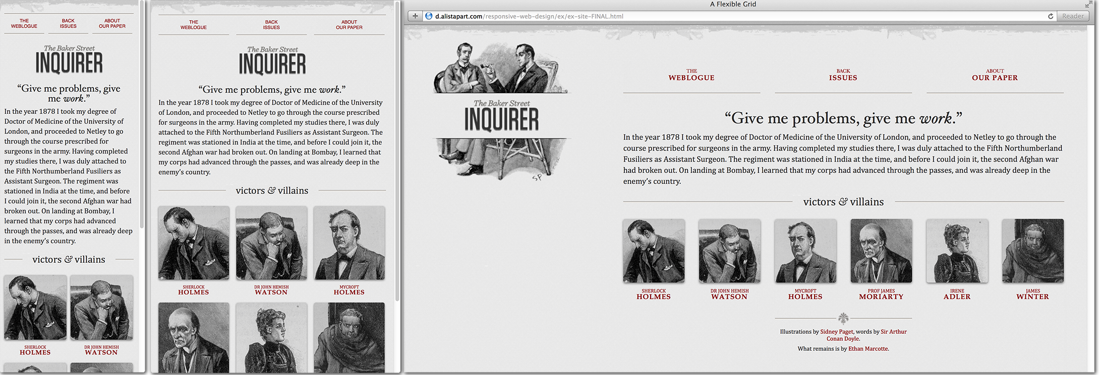
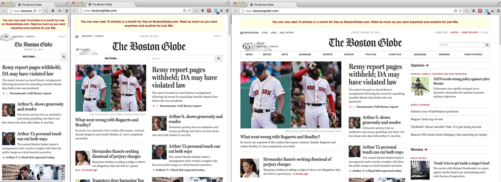
Responsive design started when a few more prominent developers made their personal sites responsive, but it quickly took off when Marcotte and the developers at the Filament Group redesigned the Boston Globe website to make it responsive. The Globe redesign showed that responsive design worked for more than developer portfolios and blogs. The Globe redesign showed that responsive design was the way of the future.
While the paper's re-do was successful from a user standpoint, Marcotte and the Filament Group did run into some problems behind the scenes, particularly with images. Marcotte's original article dealt with images by scaling them down using CSS. This made images fit smaller screens and preserve the layout of content, but it also meant mobile devices were loading huge images with no intention to ever be displayed at full resolution.
For the most part, this is still what happens on nearly every site you visit on a small screen. Web developers know, as the developers building the Globe site knew, that this is a problem. Yet, solving it is not as easy as it seems at first glance.
That dilemma is what led to today. Solving this image problem required adding a brand new element to HTML.
Introducing the picture element
The Picture element story begins with the developers working on the Boston Globe, including Mat Marquis, who would eventually co-author the HTML specification.
In the beginning, though, no one working on the project was thinking about creating new HTML elements. Marquis and the other developers just wanted to build a site that loaded faster on mobile devices.
As Marquis explains, they thought they had a solution. "We started with an image for mobile and then selectively enhanced it up from there. It was a hack using cookies and JavaScript. It worked up until about a week before the site launched."
Around this time, both Firefox and Chrome were updating their prefetching capabilities, and the new image prefetching tools broke the method used on the Globe prototypes. Browser prefetching turned out to be more than just a problem for the original Globe solution; it's actually the crux of what's so difficult about responsive images.
When a server sends a page to your browser, the browser first downloads all the HTML on the page and then parses it. Or at least that's what used to happen. Modern Web browsers attempt to speed up page load times by downloading images before parsing the page's body. The browser starts downloading the image long before it knows where that image will be in the page layout or how big it will need to be.
This is simultaneously a very good thing—it means images load faster—and a very tricky thing. It means using JavaScript to manipulate images can actually slow down your page even when your JavaScript is trying to load smaller images (because you end up fighting the prefetcher and downloading two images).
Marquis and the rest of the developers working on the site had to scrap their original plan and go back to the drawing board. "We started trying to hash out some solution that we could use going forward... but nothing really materialized." However, they started writing about the problem, and other developers joined the conversation. They quickly learned they were not alone in struggling with responsive images.
"By this time," Marquis says, "we have 10 or 15 developers, and nobody has come up with anything."
The Globe site ended up launched with no solution. Mobile devices were stuck downloading huge images.
Soon other prominent developers outside the Globe project started to weigh in with solutions, including Google's Paul Irish and Opera's Bruce Lawson. But no one was able to craft a solution that covered all the possible use cases developers identified.
"We soon realized," says Marquis, "that, even if we were able to solve this with a clever bit of JavaScript, we would be working around browser-level optimizations rather than working with them." In other words, using JavaScript meant fighting the browser's built-in image prefetching.
Talk soon moved to lower-level solutions, including a new HTML element that might somehow get around the image prefetching problems in a way that JavaScript never would. It was Bruce Lawson of Opera who first suggested that a new <picture> element might be in order. Though they did not know it at the time, a picture element had been proposed once before, but it never went anywhere.
reader comments
217